Give each screen a focus
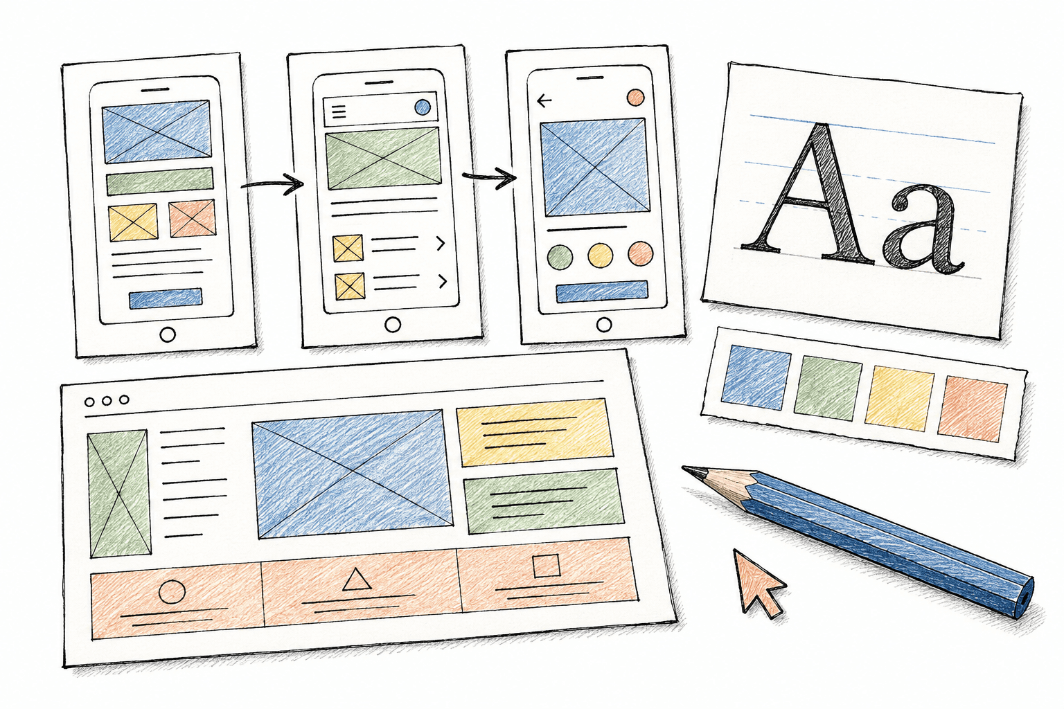
When every heading is large and every button stands out, readers have to decide what matters. Identify the screen's main action, then use size, contrast and spacing to make it clear.
A send-enquiry button can stand out more than a learn-more link. Two actions do not need to look identical to belong to the same interface.
Write labels that explain what happens next
Labels such as Send enquiry or View summary help people anticipate the next step better than a generic Continue. If an action does not send data yet, do not call it Send.
Place error messages near the field that needs attention, explain the problem and how to fix it. Keep entered information so people do not have to start again.
Test with a specific task
Instead of asking whether an interface looks good, ask someone to find a service and request advice. Watch where they pause, go back or ask questions.
Check keyboard use and small screens too. A flow that makes sense on a computer may be difficult on a phone if a button is hidden or the form is too long.
Facing a similar challenge?
Clarify your idea with Studio ↗